
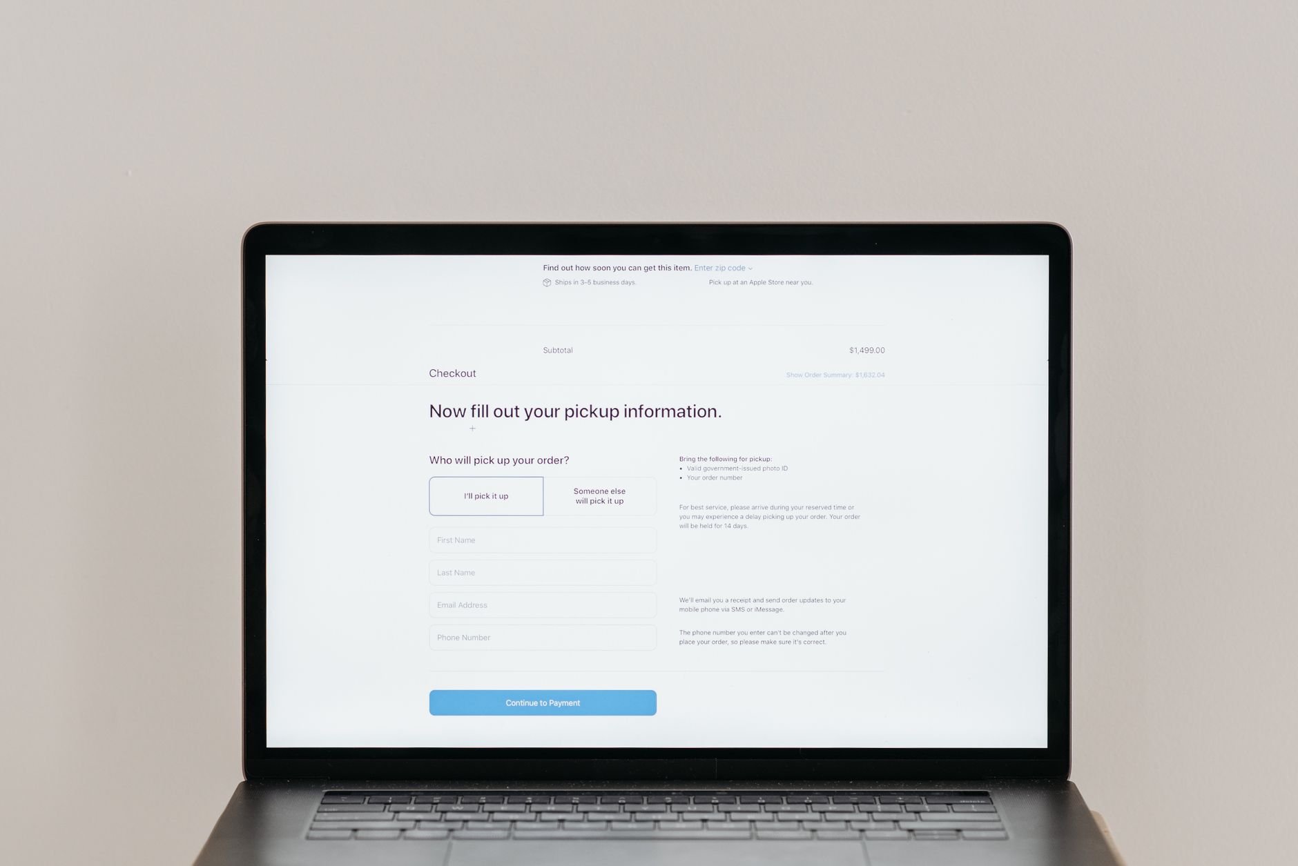
Checkout is where intent goes to die. A shopper who genuinely wanted the product reaches the final stretch and quietly abandons it, defeated by one form too many. The cause is rarely a single dramatic obstacle. It is the accumulation of small frictions, each adding a little effort and a little doubt, until the buyer gives up within reach of the finish line. Micro-step optimization treats those small frictions as the real problem and removes them one by one, and the impact on completed sales can be dramatic.
Where checkout loses people
The usual culprits are familiar to anyone who has shopped online. Long forms that demand more than the buyer expected. Forced account creation that turns a quick purchase into a commitment. Surprise costs appearing at the final step, which feel like a small betrayal. A process that seems to have too many stages, with no clear sense of how close the end is. Each of these is a small tax on the buyer’s patience, and at checkout, where the purchase is so nearly done, even minor effort is enough to tip a wavering shopper toward leaving.
The micro-step approach
Micro-step thinking breaks the checkout process into small, clear stages and asks for one thing at a time, so the buyer never faces an overwhelming wall of fields all at once. Every nonessential input is questioned and, wherever possible, removed. The guiding principle is to reduce the perceived effort of each individual moment, because perception is what drives behavior here. A checkout that feels light and quick gets completed, while one that feels heavy and uncertain gets abandoned, even when the actual difference in effort is small.
The psychology behind the effect
The reason this works comes down to how people weigh effort against reward in the moment. Every additional step raises the felt cost of completing the purchase, and at a certain point that perceived cost overtakes the desire for the product. Breaking the process into small, achievable steps also creates a sense of progress and momentum, which makes people more likely to continue. Each completed micro-step is a small commitment that nudges the buyer toward the next one, turning an intimidating form into a series of easy, manageable moves.
Tactics that work
Offer guest checkout so no one is forced to create an account simply to buy. Use autofill and express payment options to cut the typing to a minimum, since every keystroke is friction. Show clear progress so the end feels close and reachable. Strip the form down to only what you truly need, resisting the temptation to collect data that would be nice to have but is not essential to the sale. And never spring a surprise cost at the final step, because nothing destroys trust and momentum faster than a number that changes when the buyer thought they were done.
Why it adds up
Each small reduction lowers friction and the abandonment that comes with it, and none of these changes looks dramatic on its own. That is exactly why they are so often overlooked. But together they compound, and the cumulative effect on completion rates can be the difference between a checkout that bleeds buyers and one that converts the intent it worked so hard to earn. The lesson of interface ease is that conversion is rarely won by one big improvement. It is won by the patient, unglamorous removal of many small frictions.

